SwiftUI’s contextMenu modifier is a simple API that does a lot for us.
I wrote about building context menus in both UIKit and SwiftUI recently. I did not go into detail about support for the custom previews that landed in iOS 16, iPadOS 16 and macOS 13. Let us fill that gap.
Recap: Context menus in SwiftUI
A context menu is equivalent of a right-click on touch devices. Using long‑press (or Control‑click on the Mac) on a view reveals a menu of options exactly where the user needs it. In pure SwiftUI we use .contextMenu to create these menus:
Text("Document name")
    .contextMenu {
        Button("Rename", action: rename)
        Button(role: .destructive) { delete() } label: {
            Label("Delete", systemImage: "trash")
        }
    }
The context menu displays while the selected view is highlighted.

Why a custom preview matters
A preview helps the user understand what they are acting on and where it lives in your layout. A well‑chosen preview can show different information than the original view without forcing you to have that view in the main hierarchy. For example, a high‑resolution version of a thumbnail. An approach similar to what you see in the Apple Photos app.
The API: contextMenu(menuItems:preview:)
Availability
The two‑parameter overload arrived with SwiftUI 4 (Xcode 14 / iOS 16). It is available on:
- iOS 16.0+
- iPadOS 16.0+
- macOS 13.0+
- tvOS 16.0+
On macOS you still get the menu, but the system ignores the preview.
Keep that in mind when you ship multi‑platform code.
Basic syntax
struct FileRow: View {
    let file: File

    var body: some View {
        HStack {
            Image(systemName: file.iconName)
            Text(file.displayName)
        }
        .contextMenu {
            Button("Duplicate") { duplicate(file) }
            Button(role: .destructive) { delete(file) } label: {
                Label("Delete", systemImage: "trash")
            }
        } preview: {
            FilePreview(file: file)
        }
    }
}
The trailing closure labelled preview: can return any View. SwiftUI renders it inside a rounded rectangle and places it next to (which could be on the side, underneath or on top depending where the view is in the main hierarchy) the menu.
Building your first preview
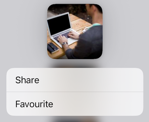
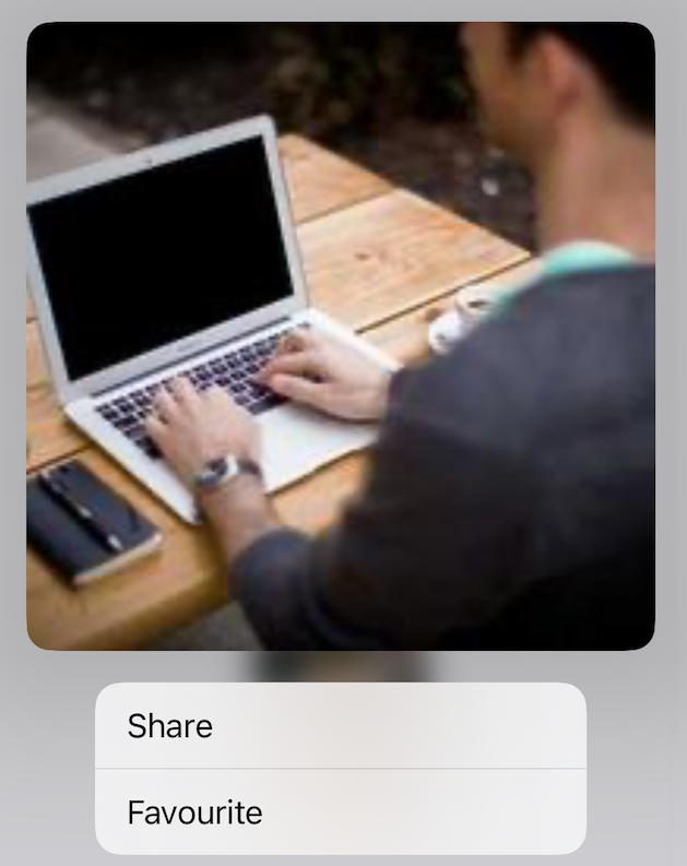
Let’s look at a minimal example – previewing a photo thumbnail. In this example, we want to increase the size of the preview to make it more clear which photo is active.
struct PhotoThumbnail: View {
    let image: Image

    var body: some View {
        image
            .resizable()
            .frame(width: 88, height: 88)
            .clipShape(.rect(cornerRadius: 8))
            .contextMenu {
                Button("Share")   { share() }
                Button("Favourite") { favourite() }
            } preview: {
                // this scope defines the preview
                image
                    .resizable()
                    .scaledToFit()
                    .frame(width: 320, height: 320)
                    .clipShape(.rect(cornerRadius: 16))
            }
    }
}
Long‑press the thumbnail and SwiftUI renders a 320‑pt version of the image. Here’s a comparison of the default preview and custom preview:
| Default preview | Custom preview |
|---|---|
 |  |
Animation and interactivity
The preview will run like any other SwiftUI view. Any animations or gesture you place inside will run just like in your main hierarchy. So it is best to keep the preview as simple and relevant as possible.
A dynamic colour sampler
Controlling the size of a photo preview is a great start. Next let’s see how the preview can share state with the root view.
In this example a long‑press on the circle allows you to pick Random colour – both the badge and its preview change hue at the same time. The preview also contains more information than the Circle view as it also displays the actual hue number.

struct PreviewSampler: View {
    @State private var hue: Double = 0                 // 1. Shared state

    var body: some View {
        Circle()                                       // 2. Original view
            .fill(Color(hue: hue, saturation: 0.8, brightness: 0.9))
            .frame(width: 60)
            .contextMenu {
                Button("Random colour") {              // 3. Menu item
                    hue = .random(in: 0...1)
                }
            } preview: {
                Circle()                               // 4. Custom preview
                    .fill(Color(hue: hue, saturation: 0.8, brightness: 0.9))
                    .frame(width: 240)                 //   scaled up
                    .overlay(
                        Text("Hue \(Int(hue * 360))°")
                            .font(.headline)
                            .foregroundStyle(.white)
                    )
            }
    }
}
Details
- Shared state.
@Statelives in the parent view, so the thumbnail and the preview stay in sync. - Independent layout. We scale the preview to 240 pt and add an overlay. The original view keeps its compact 60 pt frame.
- Single source of truth. The menu action mutates
hue. - No additional views. Everything remains in the same file.
Why this matters
- Instant feedback. Users see the effect of their action immediately.
- Accessibility. VoiceOver reads the overlay (“Hue 125 degrees”), giving additional context.
- Little performance cost. The preview reuses the same lightweight drawing code.
Conclusion
Most of the time a default preview will do what you need. But, on occassion, a custom preview can give you more screen real estate, present more clarity to the user and even show additional information if needed. Think:
- You can (and should) share state with a preview
- Use the extra real estate to expose controls or metadata that would clutter the main layout.
- A preview should be lightweight, as it is built during the long‑press gesture, so every millisecond counts. Don’t go overboard.
With that in mind enjoy the simplicity of adding previews to your context menus.
Happy coding.