The UIStackView class aligns arrangedSubviews in a column or row. It reduces the amount of auto layout code required for grid-like layouts. It also handles constraints dynamically when you add, hide, insert and remove subviews.
By default stack views arrange subviews horizontally in a row. This article will use horizontal stack views for this reason. The logic can easily be applied to vertical stack views by changing the axis property to .vertical.
Arranged Subviews
Stack views have a concise API for adding, inserting and removing arranged subviews.
stackView.addArrangedSubview(view: view)
stackView.insertArrangedSubview(view: view, at: 1)
stackView.removeArrangedSubview(view: view)
It is important to note that removing an arranged subview does not remove it as a standard subview. If we want to remove the subview entirely we can call removeFromSuperview() on the subview.
Stack views automatically handle constraint changes when views are added, hidden, inserted and removed. Adding a simple animation block can add flourish to our UI with minimal code.
UIView.animate(withDuration: 0.3) { [self] in
    arrangedSubview.isHidden.toggle()
}

We can even get a clean animation when changing our stack view axis.
UIView.animate(withDuration: 0.3) { [self] in
    stackView.axis = .vertical
}
Distribution
Distribution is a key property of a stack view. It decides how the stack view adjusts its arranged subviews to either fill its constrained space or grow on its axis. The options are:
fillfillEquallyfillProportionallyequalSpacingequalCentering
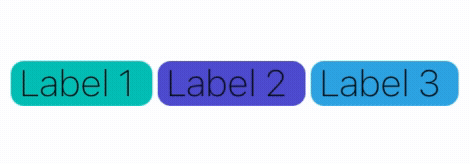
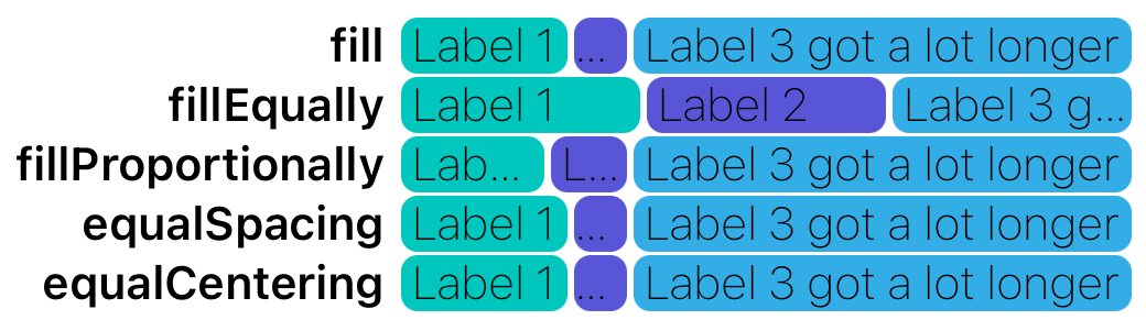
To understand distribution better we can add labels to a horizontal stack view as arranged subviews. Pinning the leading constraint of the stack view means the content can grow horizontally towards the trailing edge.

The distributions look similar when labels are roughly the same length. Increasing the length of a label exposes more differences.
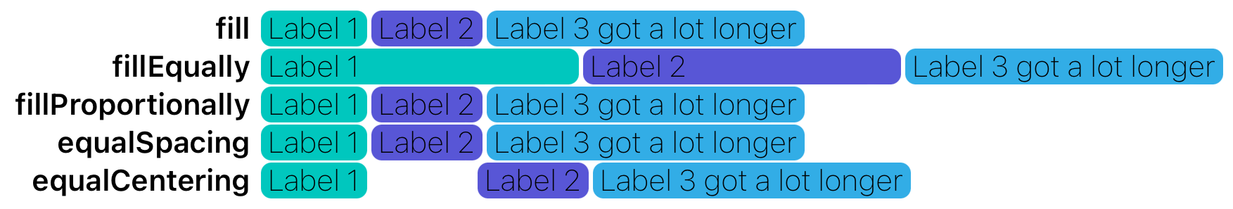
In this example, fillEqually and equalCentering grow significantly while the other distributions act the same.
fill,fillProportionallyandequalSpacingallow the labels to grow with their text or intrinsic content size.fillEquallykeeps all arranged subviews the same width. The longer label is forcing the other labels to expand.equalCenteringtries to center each arranged subview equally in the stack views width. This looks odd but if you imagine the labels maintaining their positions, but label 3 text was “label 3”, you can imagine the equal spacing between them that’s caused by label 3 being longer.
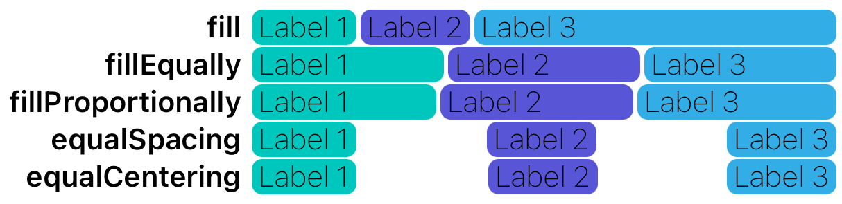
If we now pin the trailing edges of the stack views to some other edge, this will stretch the stack view and show more differences between distributions.
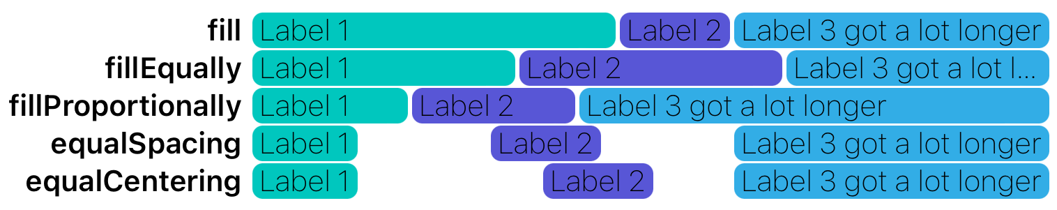
fillfills all the space to the constrained edge. To do so it stretches labels based on their content hugging priority.fillEquallycontinues to keep all labels the same width, truncating the longer label.fillProportionallydoes what it says on the tin. Labels 1 and 2 are equal proportions but label 3 is longer so it takes up more space relative to the length of labels 1 and 2.equalSpacingtries to keep equal space between the labels. Notice how the white spaces between the labels are virtually the same.equalCenteringtries to keep an equal distance between the centre (🇬🇧) of the labels.
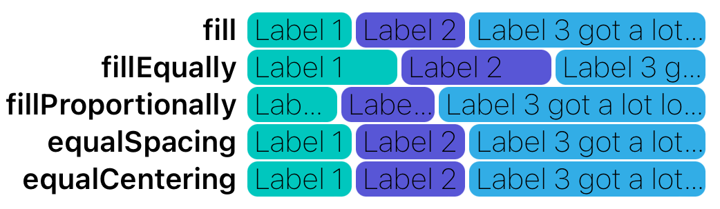
This gives a sense of how different distributions act under the two most common scenarios for a stack view:
- An unconstrained edge allowing the stack view to grow if needed.
- A constrained edge forcing the stack to grow and distribute arranged subviews.
Squashing and Expanding
When a stack view is constrained on both edges, the stack view has to either squash or expand its arranged subviews. The stack views distribution, along with arranged subviews compression resistance and content hugging priorities inform the stack views layout. The gif below shows how different stack views could act when squash or expanded.

Compression Resistance
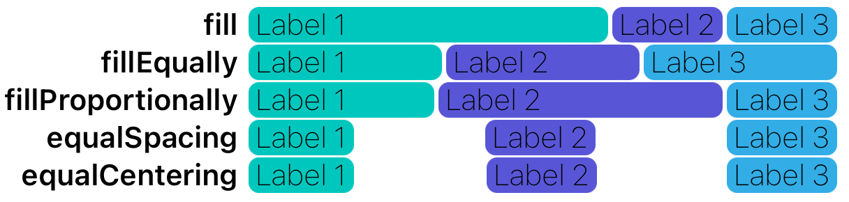
Compression resistance defines how our subviews act when squashed. If we pin the trailing edge of our stack views in a way that compresses the labels we get the following.
fill,equalSpacingandequalCenteringcompress the labels based on compression resistance priorities. In this case, the labels have equal compression resistance priorities so the stack view compresses the last label.fillEquallyignores compression resistance and focuses on equal distribution.fillProportionallyignores compression resistance and focuses on proportional distribution.
To prevent label 3 from being compressed we can increase its compression resistance priority. As the name suggests, compression resistance is how much a view wants to avoid being compressed. The priority can range from 0 to 1000.
label.setContentCompressionResistancePriority(.init(999), for: .horizontal)
Now label 3 is only compressed by fillEqually.
Interestingly apple’s documentation for both fillEqually and fillProportionally omit any reference to compression resistance yet, in this example, even fillProportionally respects the compression resistance of label 3.
Content Hugging
The content hugging priority is the flipside of compression resistance. Content hugging defines how much a view wants to resist being stretched or how much a view wants to hug its contents. Take an example where our stack views are constrained to a width wider than the intrinsic content size of our labels. In some distributions, the stack views have to stretch the labels.
Notice how all the fill oriented distributions stretch the labels.
If we want label 3 to hug its content rather than grow to fill the stack views space we can increase the content hugging priority of the label.
label.setContentHuggingPriority(.init(999), for: .horizontal)
Now both fill and fillProportionally respect label 3s desire to hug its content.
Alignment
The alignment property of a stack view defines how it should arrange subviews perpendicular to the axis. The options for this property are largely self-explanatory, especially when viewed alongside the default fill.
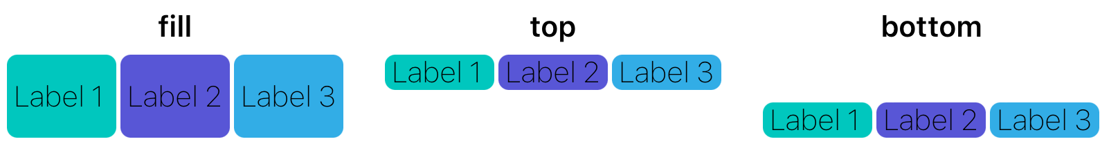
Notice how top and bottom align the stack to the top and bottom of the stack views constrained height, rather than filling it. For vertical stack views, leading, center and trailing work in a similar way.
firstBaseline and lastBaseline are two lesser-used options. They are typically used with multi-line text to define where to align text in relation to other text. To make it more obvious, we can see how firstBaseline and lastBaseline react when we alter the font and number of lines for a label.
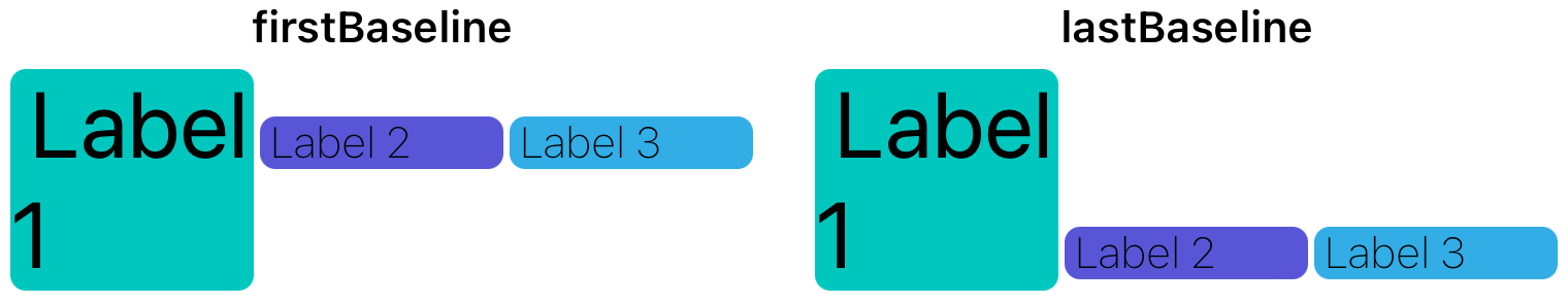
firstBaseline tries to align text along a first line regardless of the font size. lastBaseline tries to align text along the last line.
Spacing
For “filling” stack views like fill, fillEqually and fillProportionally it is simple to set the spacing between all arranged subviews as well as set spacing after specific views.
stackView.spacing = 10
stackView.setCustomSpacing(5, after: subview)
## Margins
Stack views constrain themselves to their bounds. To add margins we set isLayoutMarginsRelativeArrangement to true and then provide some margins.
stackView.isLayoutMarginsRelativeArrangement = true
stackView.directionalLayoutMargins = .init(top: 40, leading: 40, bottom: 40, trailing: 40)
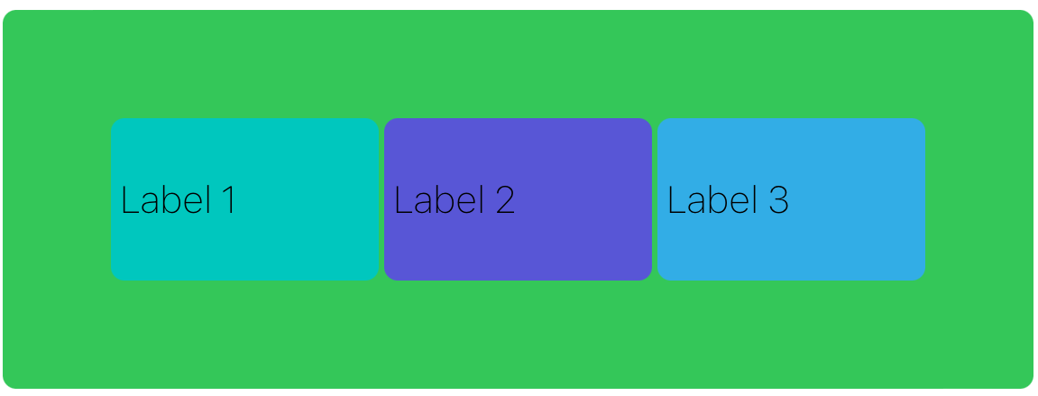
Background
Notice how the above image has a green background. This cannot be achieved by setting the background color of the stack view. Stack views are just fancy layout helpers. Setting the background color does nothing as no true “view” is rendered. To get a background on a stack view we can add a subview (not arranged subview) and pin it to all edges.
let backgroundView = UIView()
backgroundView.translatesAutoresizingMaskIntoConstraints = false
backgroundView.backgroundColor = .systemGreen
backgroundView.layer.cornerRadius = 5
stackView.addSubview(backgroundView)
backgroundView.topAnchor.constraint(equalTo: stackView.topAnchor).isActive = true
backgroundView.leadingAnchor.constraint(equalTo: stackView.leadingAnchor).isActive = true
backgroundView.trailingAnchor.constraint(equalTo: stackView.trailingAnchor).isActive = true
backgroundView.bottomAnchor.constraint(equalTo: stackView.bottomAnchor).isActive = true
Conclusion
Stack views are great for most layouts, especially as the majority of layouts requires some form of alignment along vertical and horizontal axis.
Stack views also reduce the amount of code needed to create layouts. Their automatic constraint management when altering arranged subviews is an added bonus.
## Links
- https://github.com/mgopsill/MGStackViews
- https://developer.apple.com/documentation/uikit/uistackview Sign up for more like this.